Brand Design
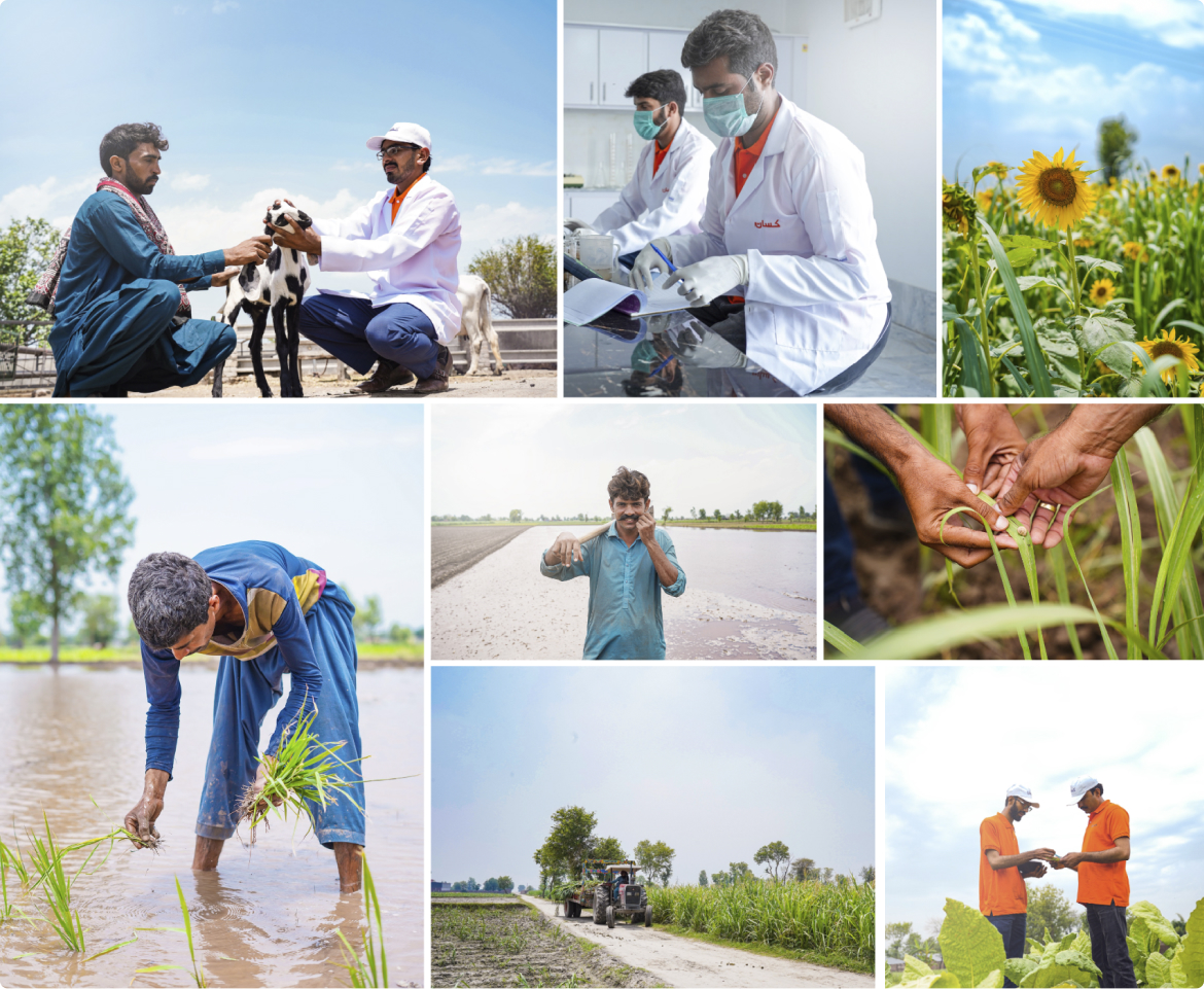
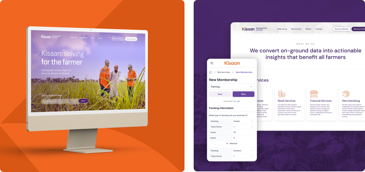
Reflecting Kisaan’s commitment to making agritech services accessible to all, the idea was to design a brand that is accessible to the local farming community in its visual language and tone of voice.
Kisaan’s brand was based on 3 core values:

Logo:
For the logo, we ideated on multiple variations that could effectively convey the brand message. The final logomark was a visual blend of innovation and agriculture.


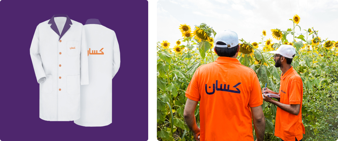
We ensured that the logomark is adaptable to Urdu to be relatable to Kisaan’s diverse audience.

Typography and Color Palette:
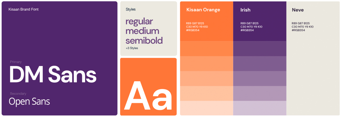
Kisaan’s brand colors, which are bright and vibrant, aimed to represent hope and optimism. We analyzed competitor brands’ colors to create a distinct palette that makes Kisaan stand out.

A nod to fresh soil and citrus, the color orange also denotes energy, passion, and growth, while purple symbolizes dignity, innovation, and creativity.
Icons and Illustrations:
We also designed iconography and illustrations for the brand’s communication. The aim was to craft creatives that are bright and dynamic, and accurately visualize Kisaan’s identity and processes.
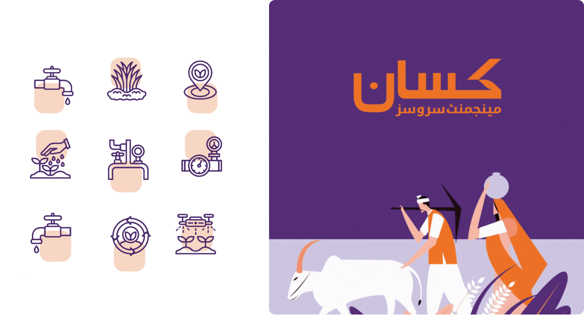
The icons were in simple line art form, to make the visuals easy to understand. The illustrations were vibrant and bold to make the brand stand out.
Brand Collateral
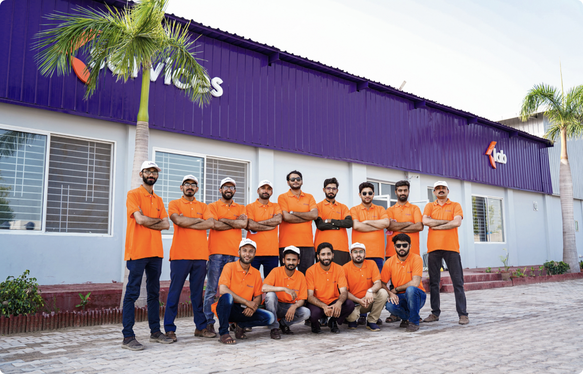
Once Kisaan’s brand identity had been planted, it was time to bring it to life. The main branded collateral consisted of business cards, uniforms, and badges for in-store service reps. and in-field lab assistants.


Our most fun playground, however, was the storefronts and service centers. To fully cement Kisaan’s brand, we designed customized graphics for the center locations, including signage, murals, and stickers.
