The Brief
With Dbank, our project goals were to design a mobile app and establish a strong brand presence in Pakistan’s competitive banking and fintech sectors. Our project’s key elements were product design, website development, and brand design.
Building Pakistan’s first digital bank, from Idea to App
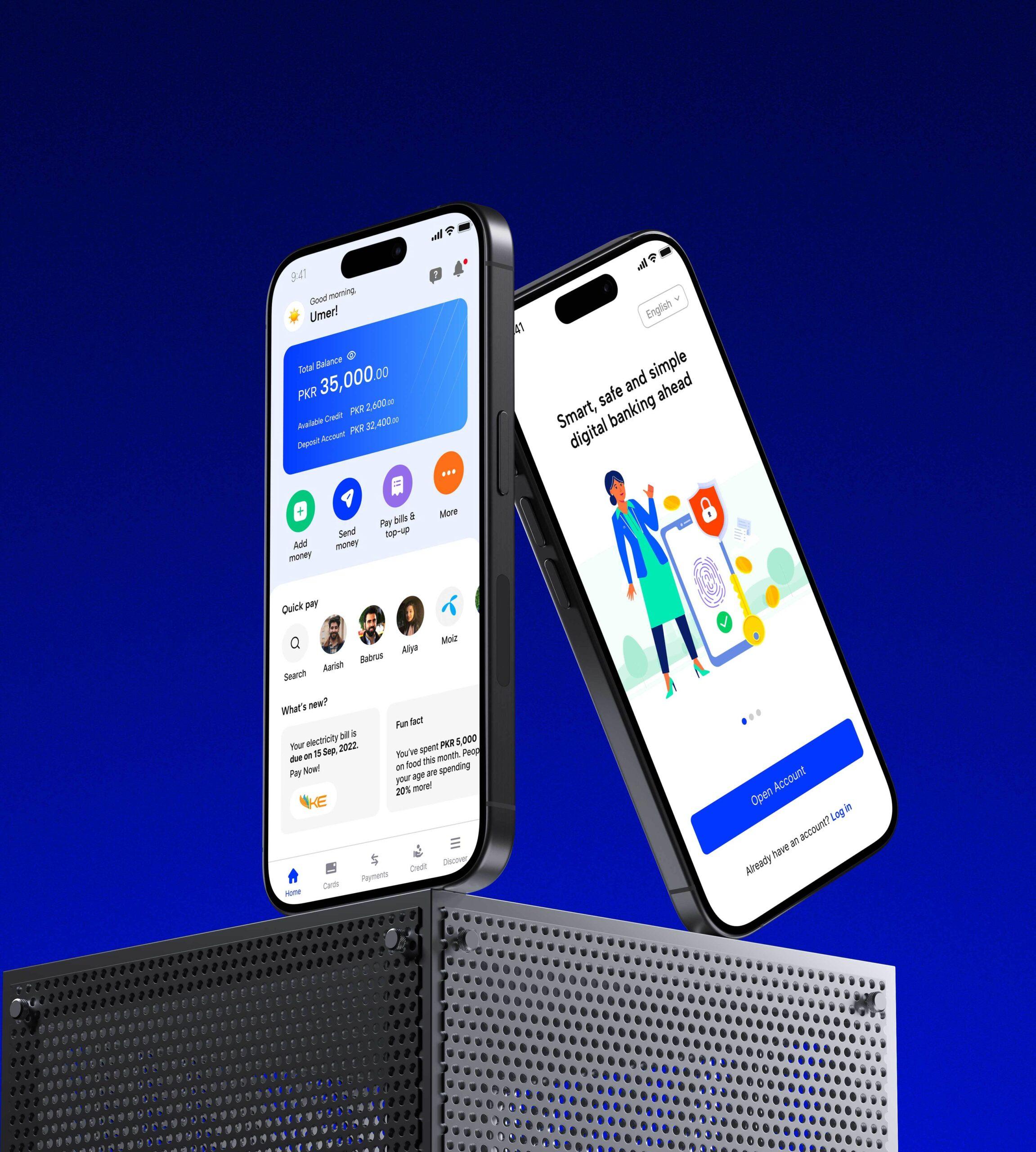
Dbank came to YODA with a singular mission: to become the country's first fully digital bank and transform Pakistan's financial landscape. The company had recently secured seed funding, and establishing a brand was essential not only for investor confidence but also for a successful market launch.
Pakistan, home to one of the world's largest financially underserved populations, was at the heart of Dbank’s commitment to redefine banking — making financial services universally accessible, and transcending geographical and socio-economic boundaries.
Turning the client's initial idea into Dbank was an exciting project that involved product design and branding from scratch. We conducted extensive research to design a product and identity that can truly make its mark on the industry.
“YODA has been instrumental in bringing my team's vision to life. Their project management, content, and design teams are amongst the best ones I have worked with so far”
Umaima Shoaib
CPO, Din Global
With Dbank, our project goals were to design a mobile app and establish a strong brand presence in Pakistan’s competitive banking and fintech sectors. Our project’s key elements were product design, website development, and brand design.
Our first step in the design process was to define the brand with a brainstorming exercise. We collaborated with the client and asked them to describe how they see Dbank as a brand.
Ultimately, Dbank stood for 5 core values:

To adapt to Pakistan’s competitive banking and fintech sector, the logo design was kickstarted by a comp analysis. We then got to sketching our many ideas for Dbank’s logo. When we say “many”, we mean over two hundred, no big deal!
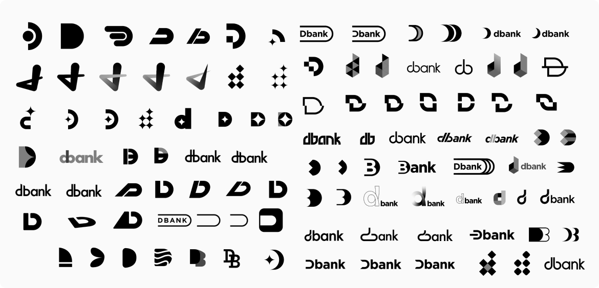
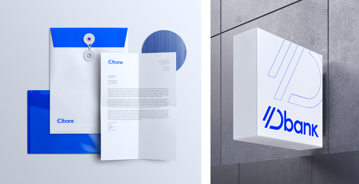
The final logo was a clean and dynamic wordmark that visually connected to the parent company. Now that we had a winner, it was time to color it. We tested multiple color options not just on the logo, but on digital collateral as well. The color that resonated the most with us and the client was Dbank Blue.
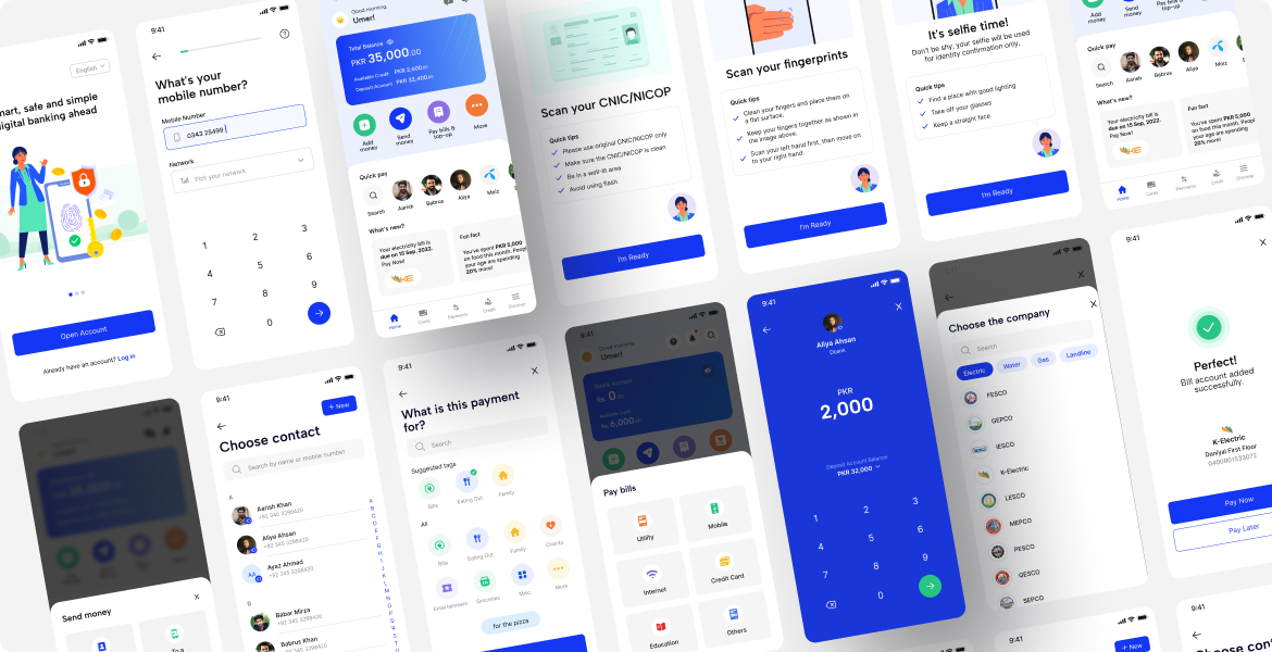
Our product design process for Dbank encompassed various aspects of UX and UI design, including wireframing, prototyping, and usability testing, all of which were developed and tested in parallel with the design language of the product.
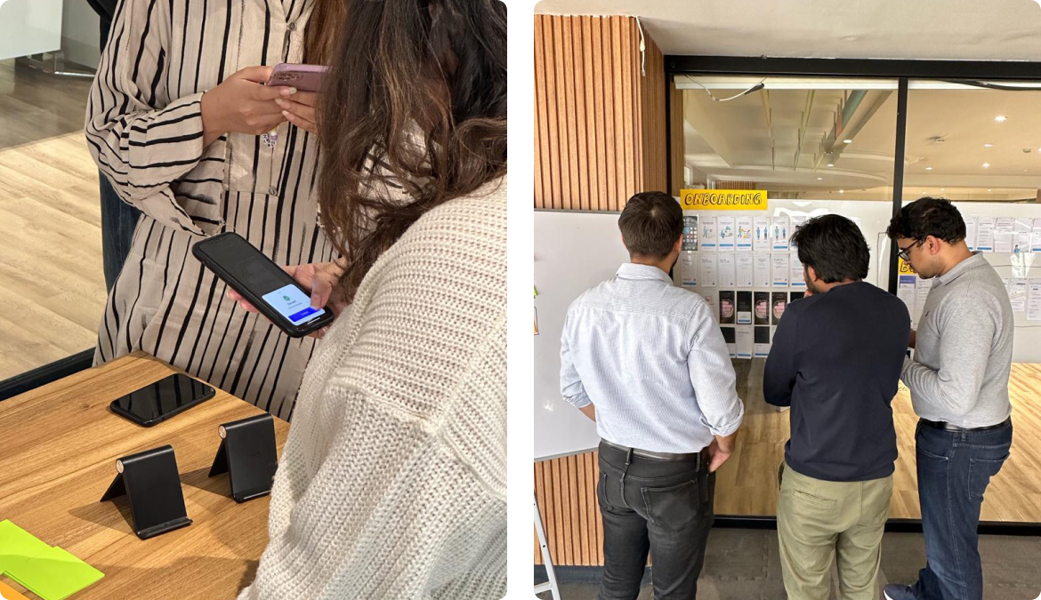
This is where user research came in — our initial wireframes were extensively tested with users to guarantee a seamless experience. The prototype went through numerous iterations based on user feedback and insight.
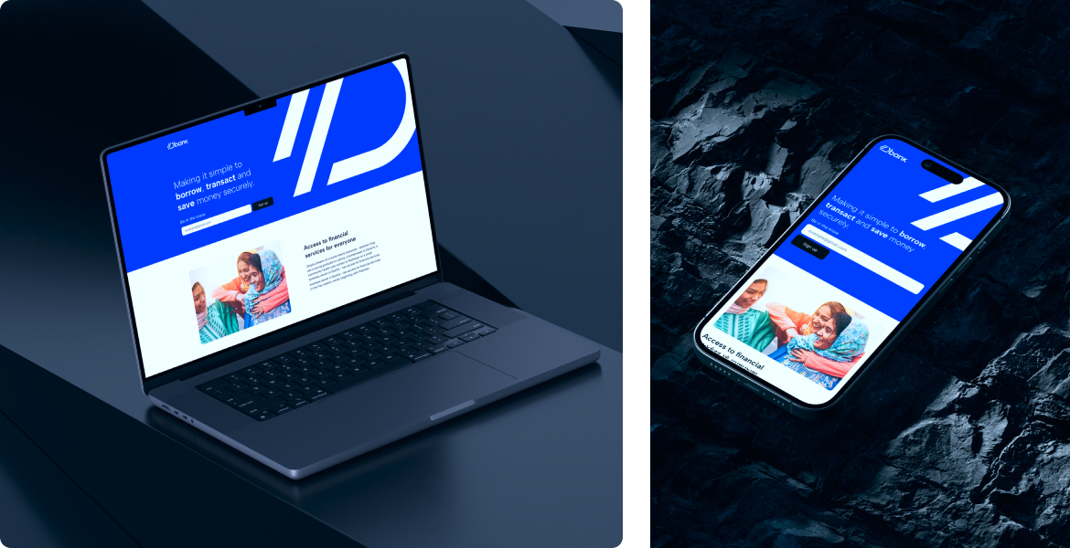
Once we had the design system and mobile app in place, we also designed a streamlined, mobile-responsive landing page, amplifying Dbank’s visibility online.
